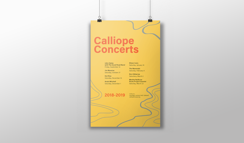
I explored the importance of hierarchy in communication design with this project, finishing off my exploration with poster delineating information on a contemporary roots concert.
| Individual | |
| Duration | Fall; 2 weeks |
| Medium | 2 page sperad; video animation |
| Tools | InDesign, Illustrator |
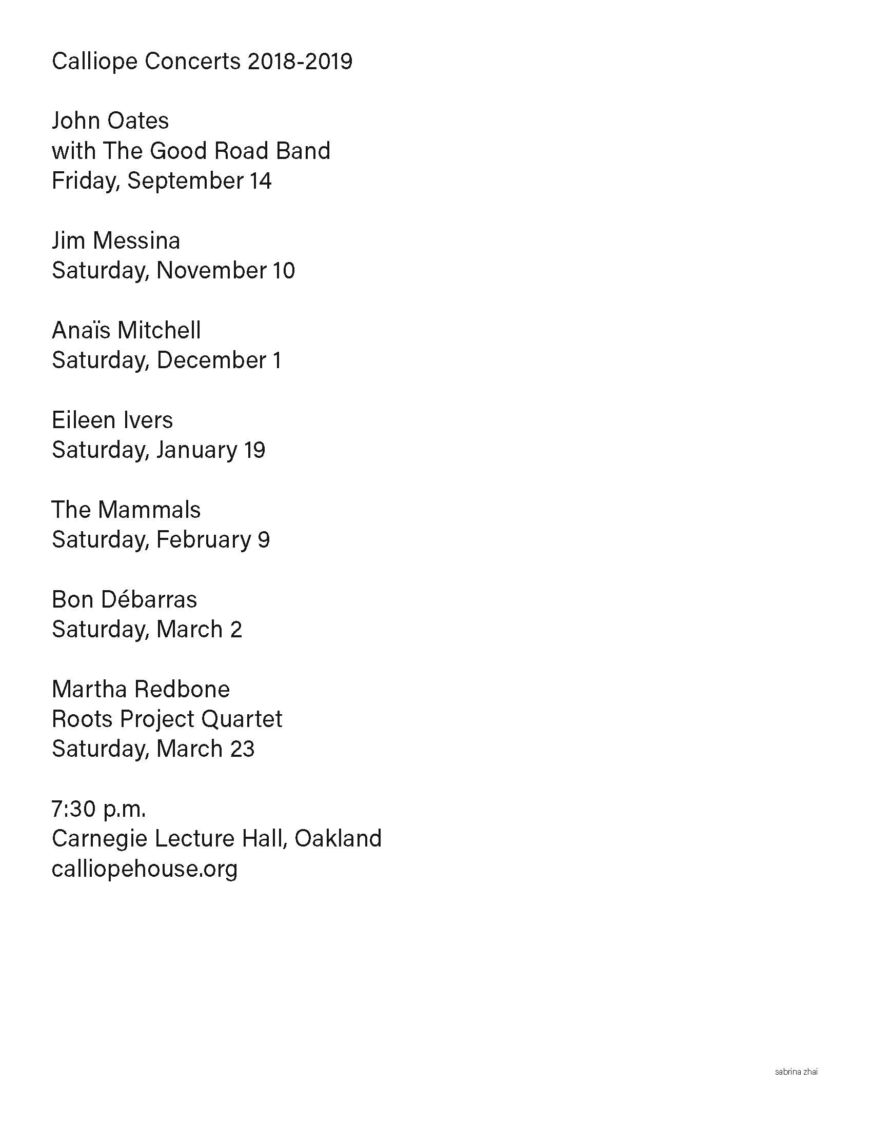
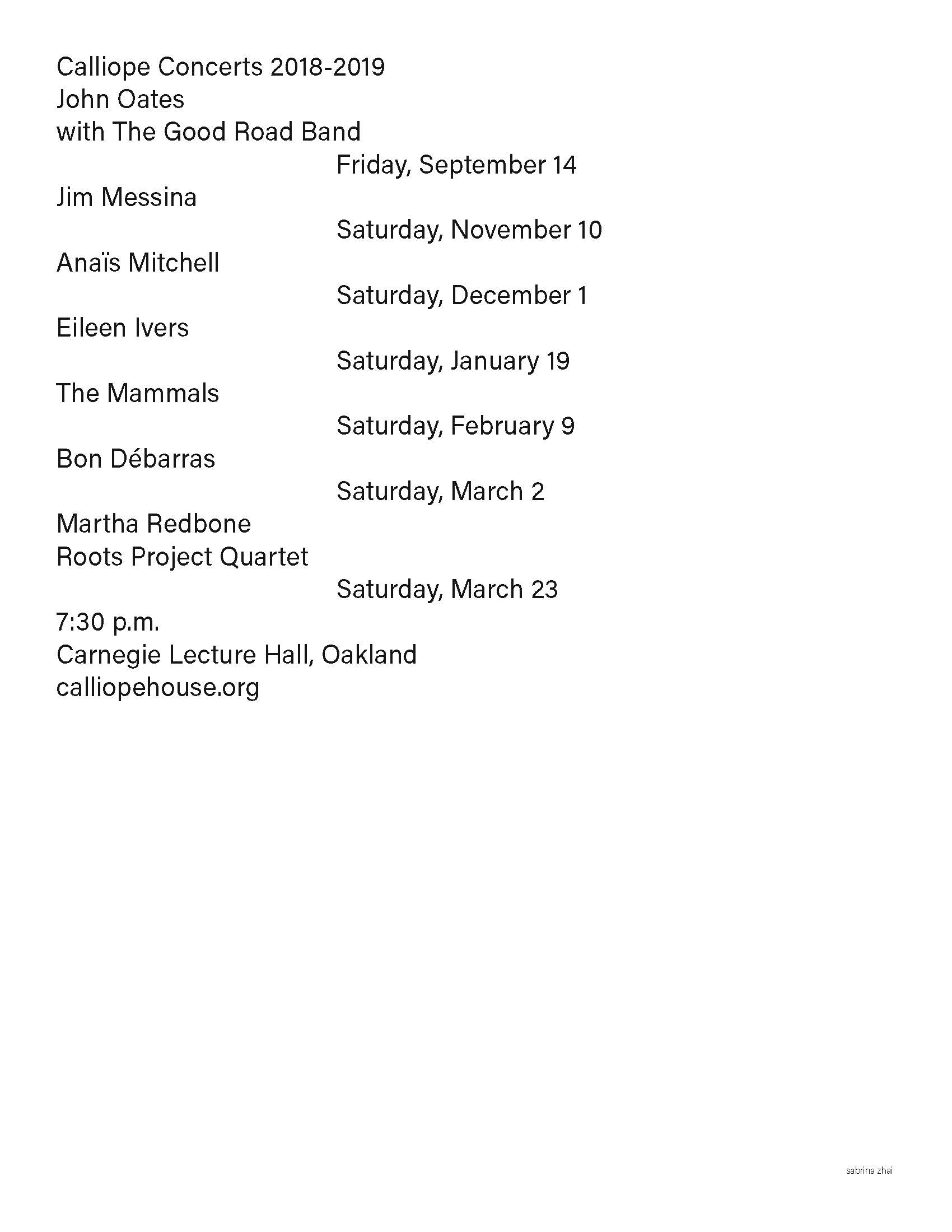
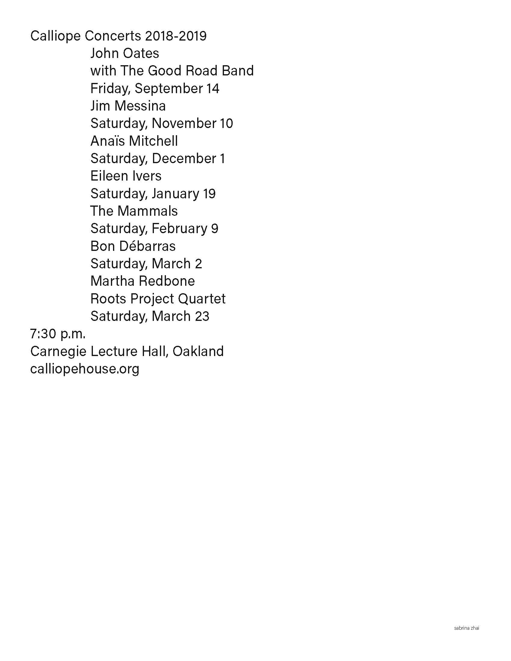
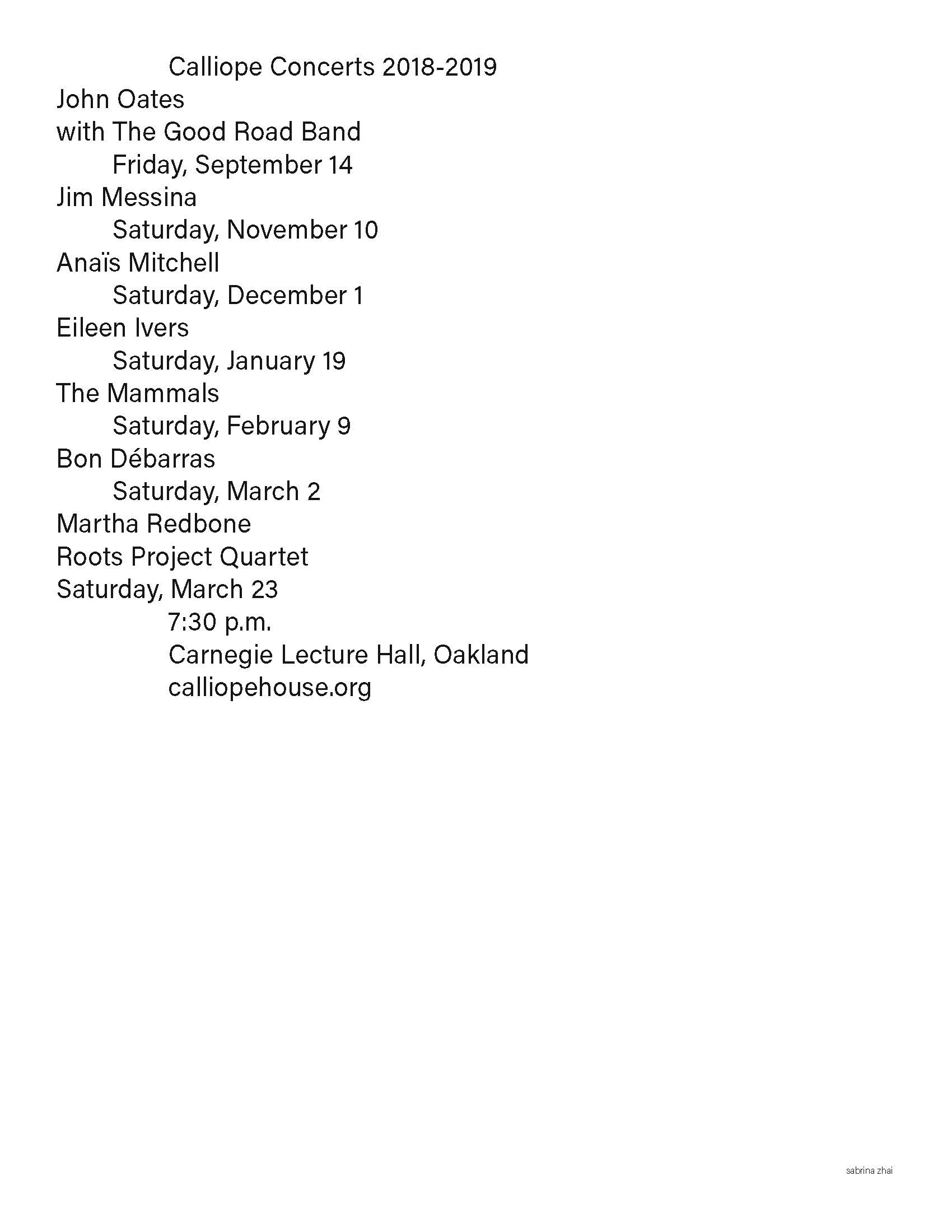
Before designing the poster, I went back to the basics of understanding hierarchy by manipulating only one element a couple times to gain a sense of what created the best hierarchy. Below, I played with lineweight of the typeface, linespacing, and indent space.


I began playing with shapes next, drawing random, squiggly lines around the text that I had laid out.
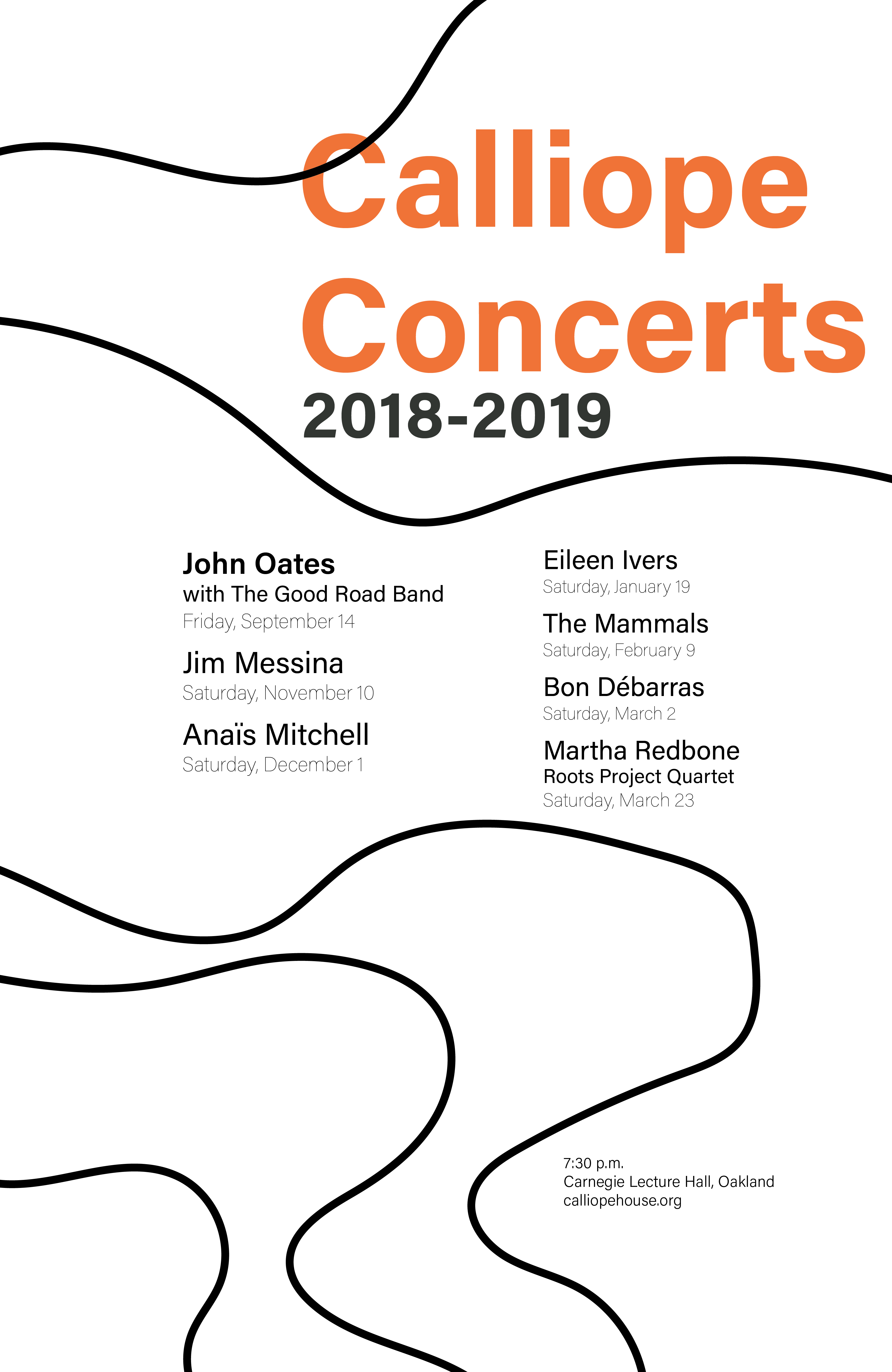
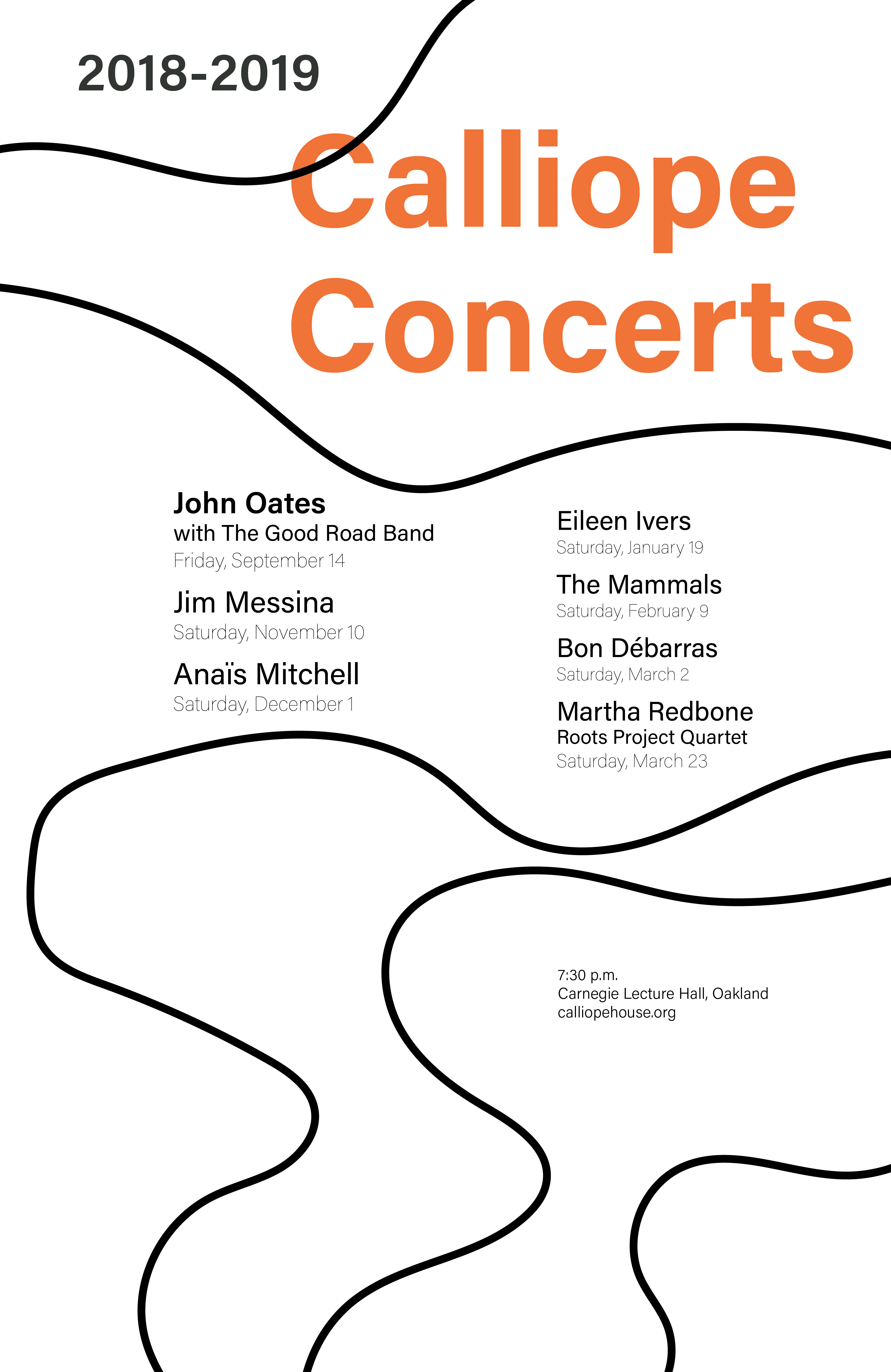
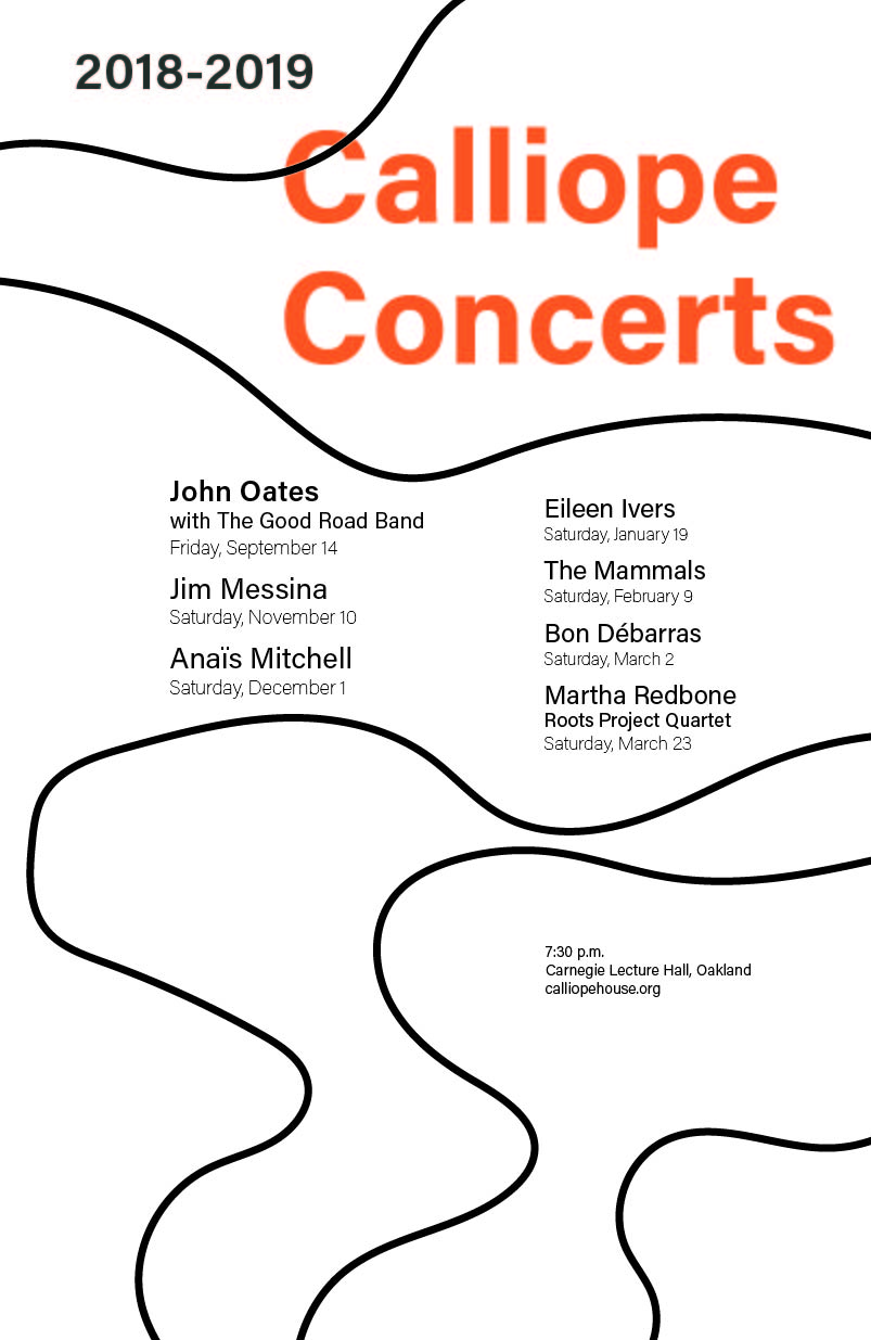
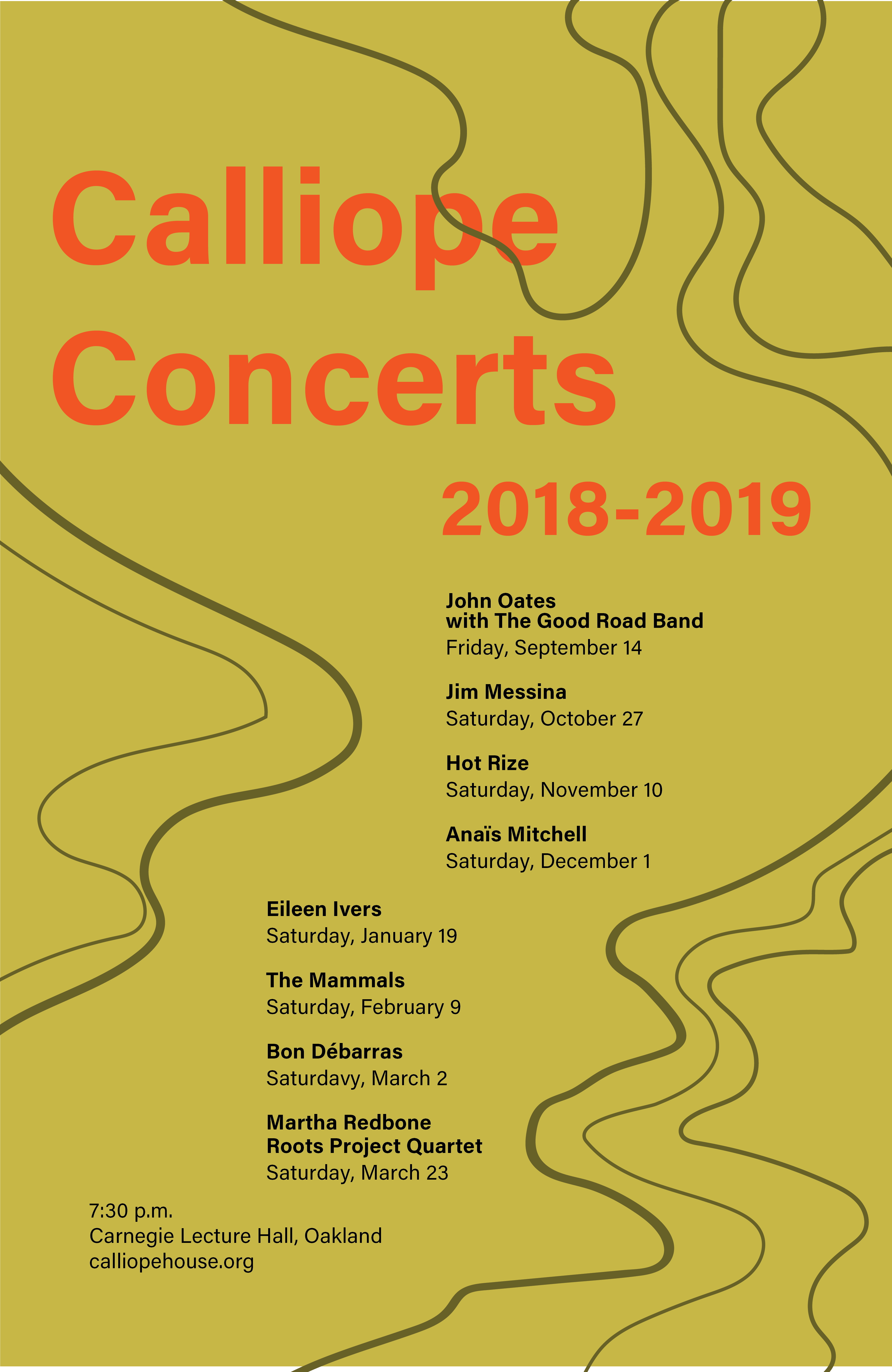


I continued my exploration amongst similar designs before coming to my conclusion that I felt best portrayed the feelings of folk music in my color palette and best displayed hiearchy of the information I needed to give in a poster.
For more process, check out my medium.
