A typeface spread and video animation about Bodoni, a modern font with high contrast between strokes and generally used in elegant settings.
| Individual | |
| Duration | Fall; 3 weeks |
| Medium | 2 page sperad; video animation |
| Tools | InDesign, AfterEffects |
Prior to this project, I knew the casual differences between typefaces: san serif vs serif, rounded vs geometric, etc. However, it wasn’t until careful considerations of the details of our font did I really begin to understand how even a simple difference in a serif (unbracketed vs bracketed, how thin the serif is, etc.) can cause a difference in the setting of the typeface and the mood it conveys.
I did some initial research on Bodoni and wrote an essay about it, covering its history, usages, highlighting characteristics, why certain attributes of Bodoni allows for certain usages (ex: high contrast allows for sophisticated yet boldness, perfect for high end fashion).
We began exploring spreads, exploring how to best convey our body copy with both visual aesthetics without taking away from the readability of our text. Initially I sketched out some brainstorms of where text and images can go in general before even tackling my body copy.
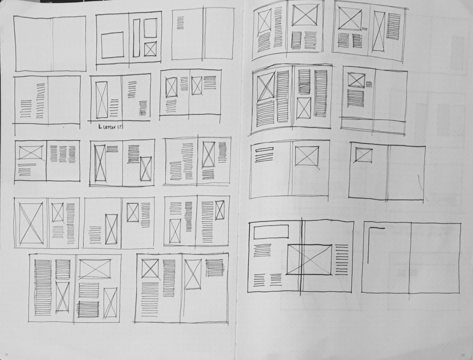
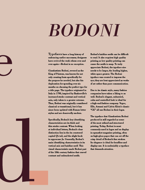
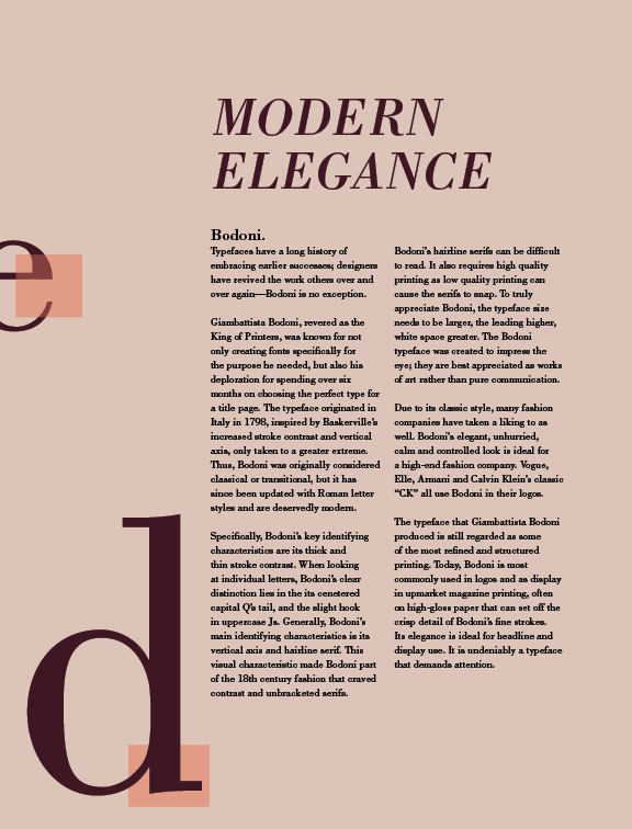
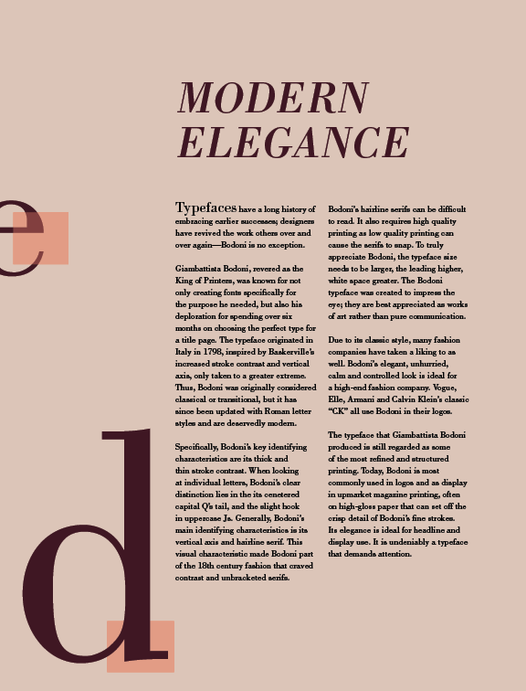
We also needed to keep whitespace, leading, linespacing, etc in mind as we created our spreads. For my particular font, I wanted to keep plenty whitespace due to Bodoni’s tendency to be hard to read, as well as simply give more breathing room to the reader as they go through the spread.
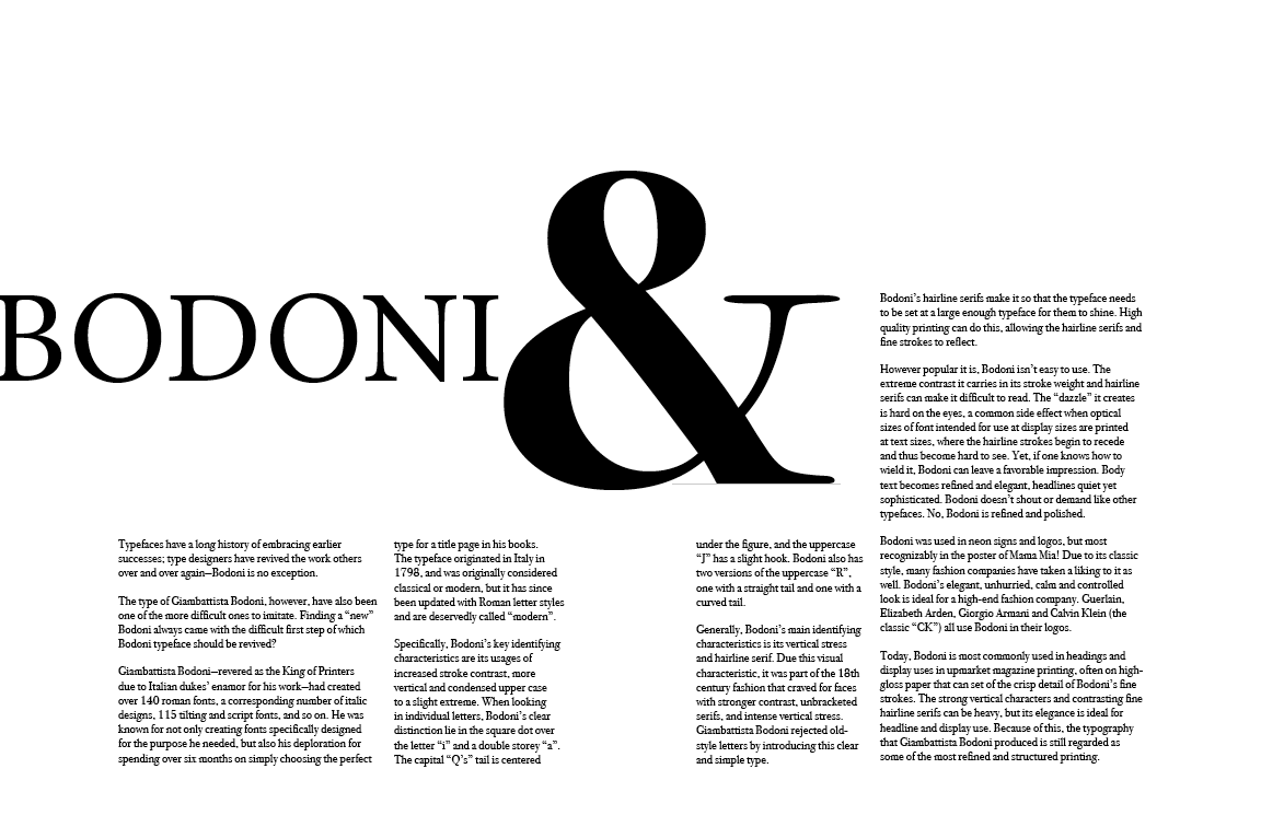
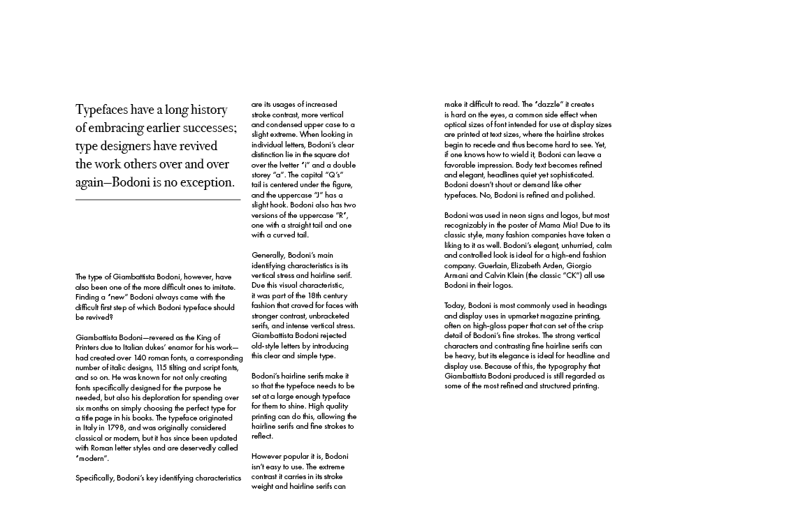
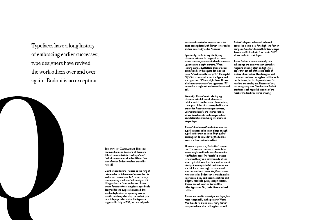
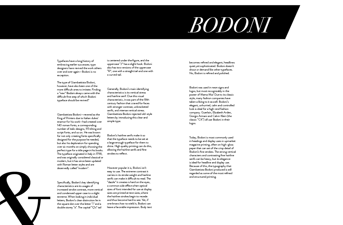
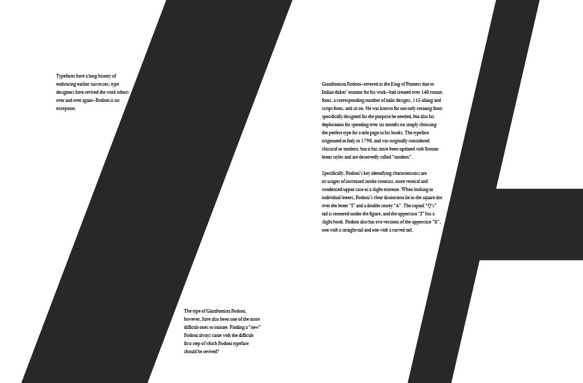
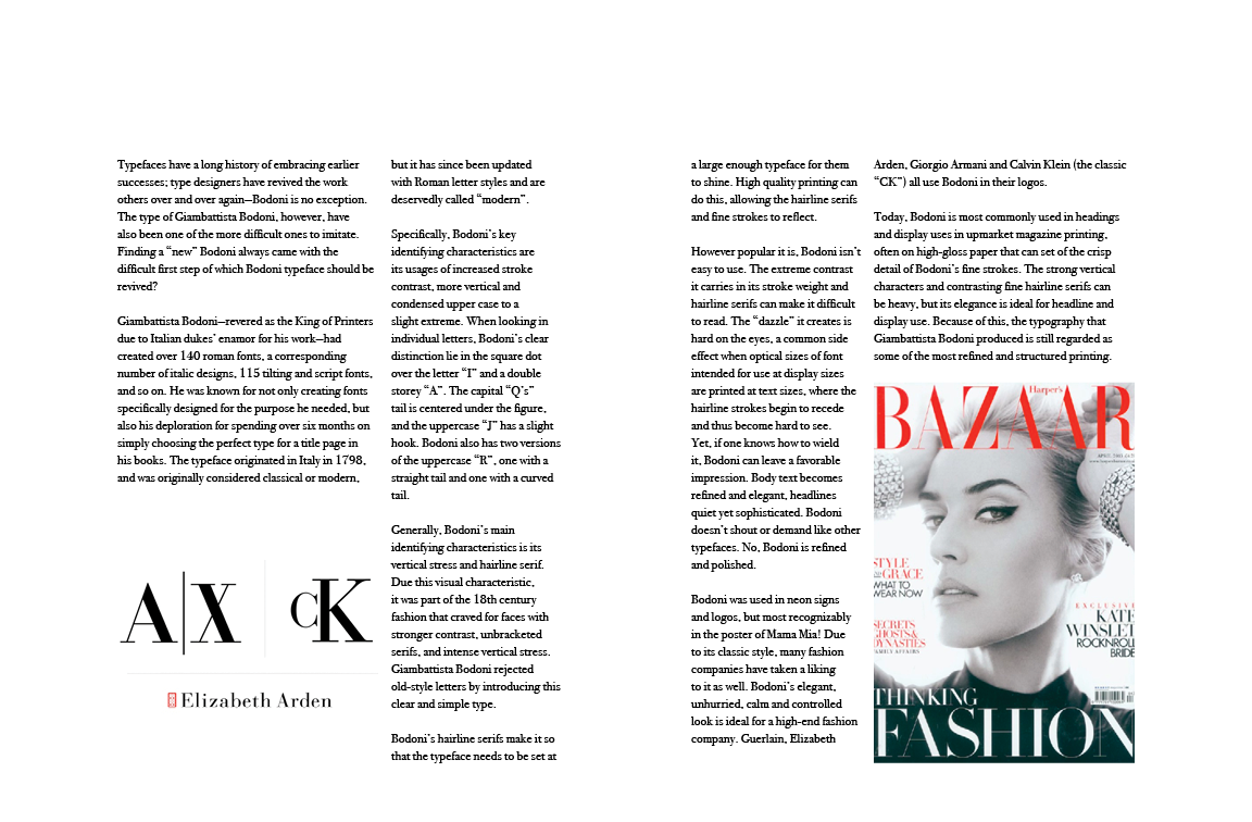
I mostly used black/white layouts due to their contrasting nature. I thought this would best highlight the bold and “high contrast” nature of Bodoni but later realized I hadn’t been pushing my exploratory boundaries enough.
Still, I later tried some other designs with the same black and white palette to fully test out some contrast, as seen by the spread with black backgrounds, though I decided that light text would be hard to read.
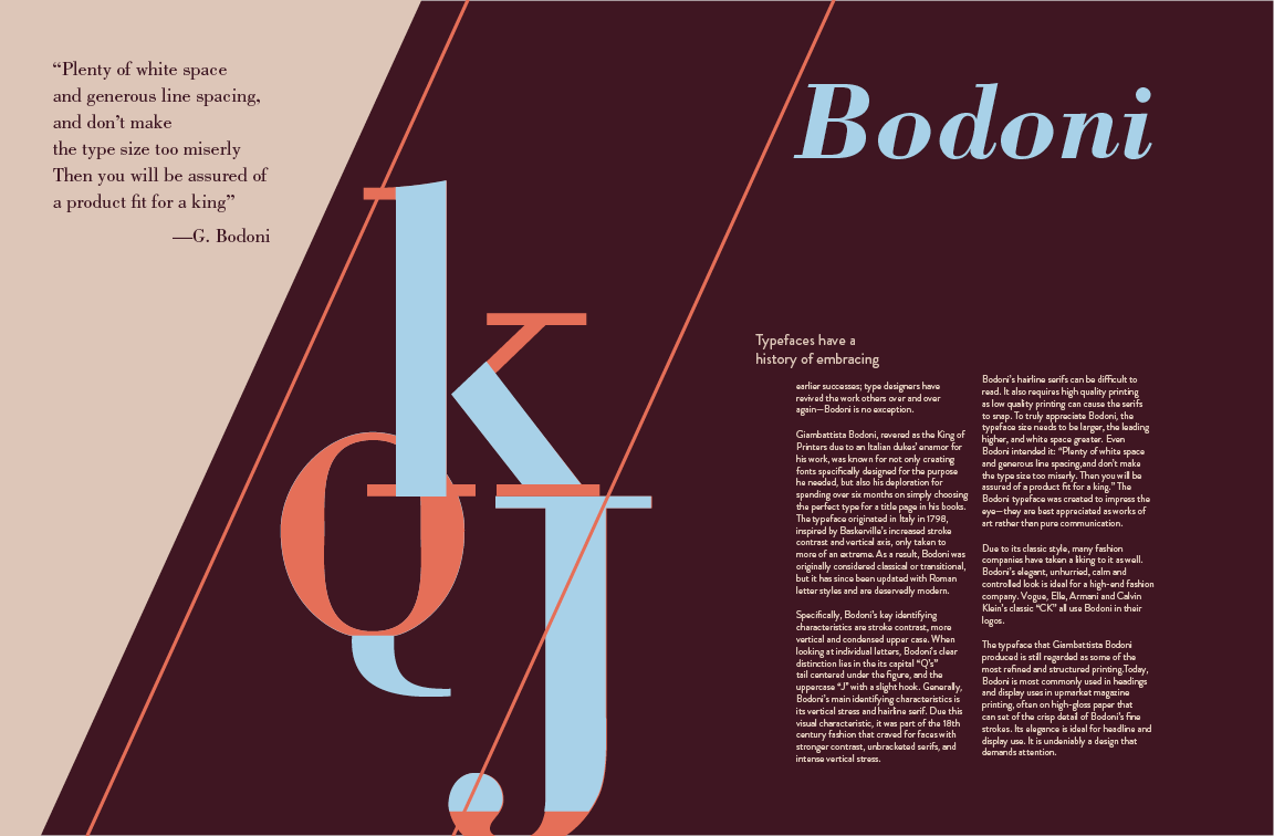
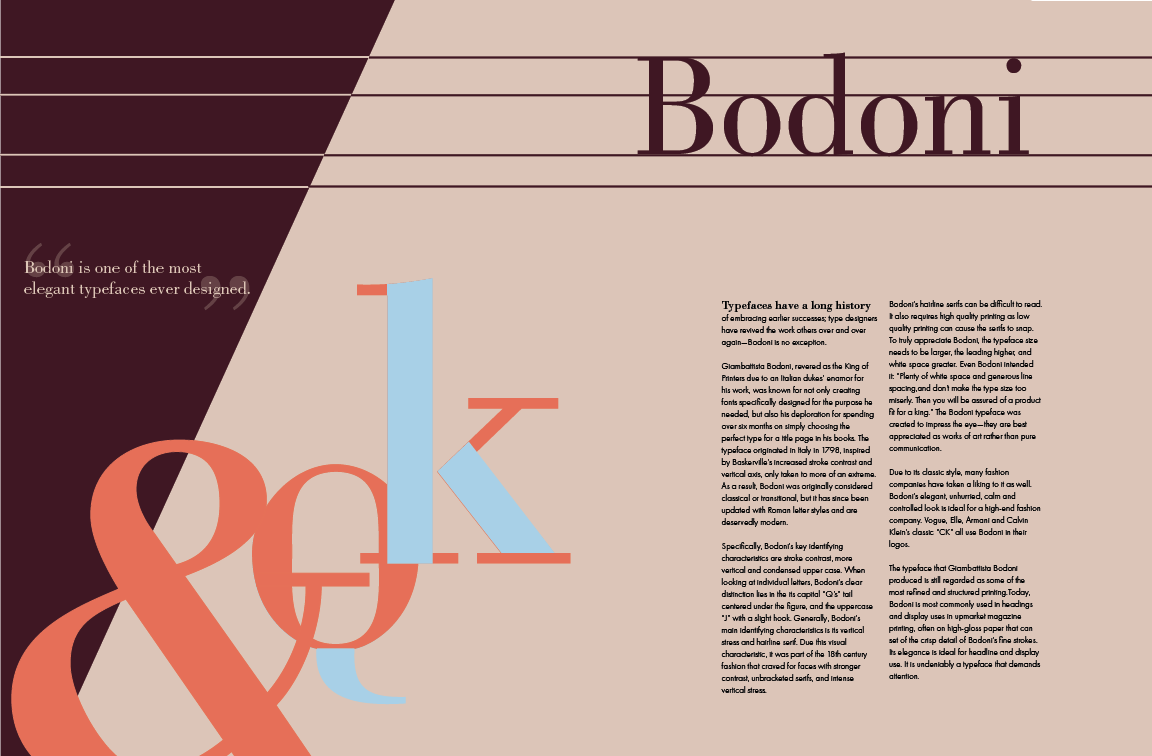
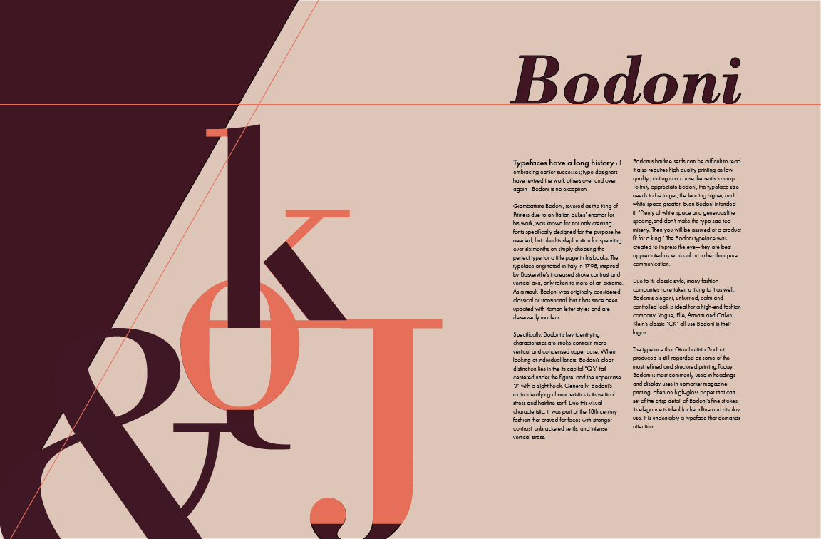
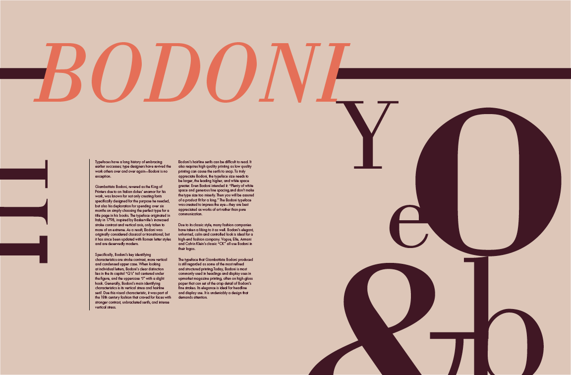
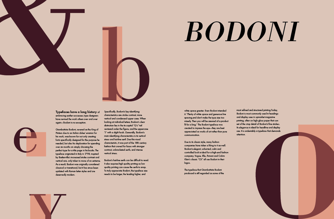
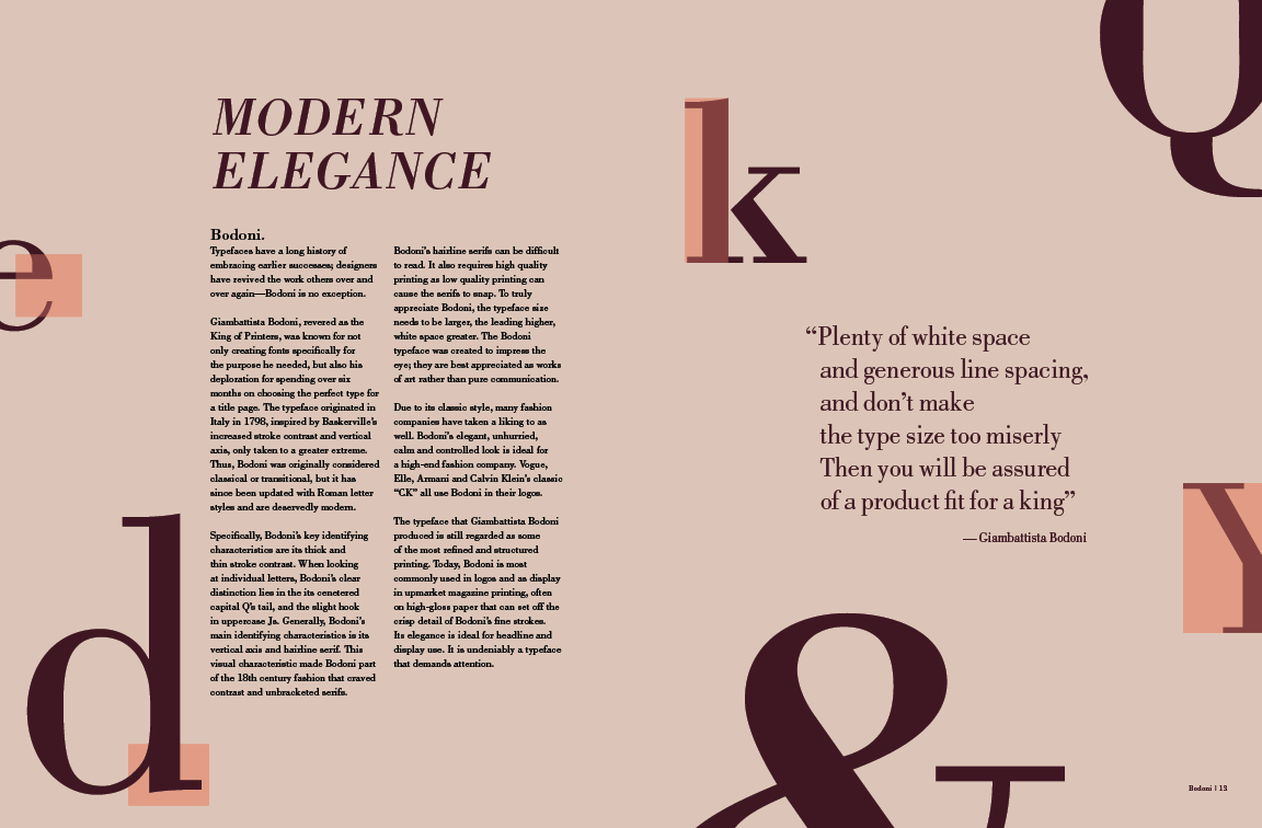
I chose my last spread for more in depth exploration as I enjoyed the way I still highlighted the key characteristics of Bodoni but kept them sparse so that there was still plenty of breathing room for the readers. Even though the ones with a diagonal line had some space in the diagonal block, there wasn’t a lot of room to help with the readability of my spread.
I also thought about using a complimentary san serif font, such as Futura, Brandon Grotesque, Helvetica, etc. In using them, however, it felt a little off as they seemed to all have too much personality and competed with the boldness of Bodoni. It also felt as though the “elegant” touch of Bodoni was lost, so I decided to use Bodoni as my body text instead, and carefully follow Giambattista Bodoni’s own thoughts: “Plenty of white space and generous line spacing, and don’t make the type size too miserly.”
I also played around with how the title and font is presented. I didn’t really like how Bodoni looked across the page; it was too big and too loud and I enjoyed the way I wrote my body copy with a general statement about type and then revealing the font was Bodoni. As a result, I switched my title to “modern elegance” instead and left out a subheader.

I started off this process by listing out the adjectives I used to describe my typeface, Bodoni, in the typeface spread project: bold, sophisticated, elegant, high contrast. I wanted to convey these attributes in my video through my animation rather than simply through words.
Afterwards, I listed out everything I wanted to cover in my video: letterform characteristics, usages of Bodoni, history, most notable uses, etc. Following my quick brainstorm, I started to draw out each scene in my sketchbook for a clearer idea of what to do.
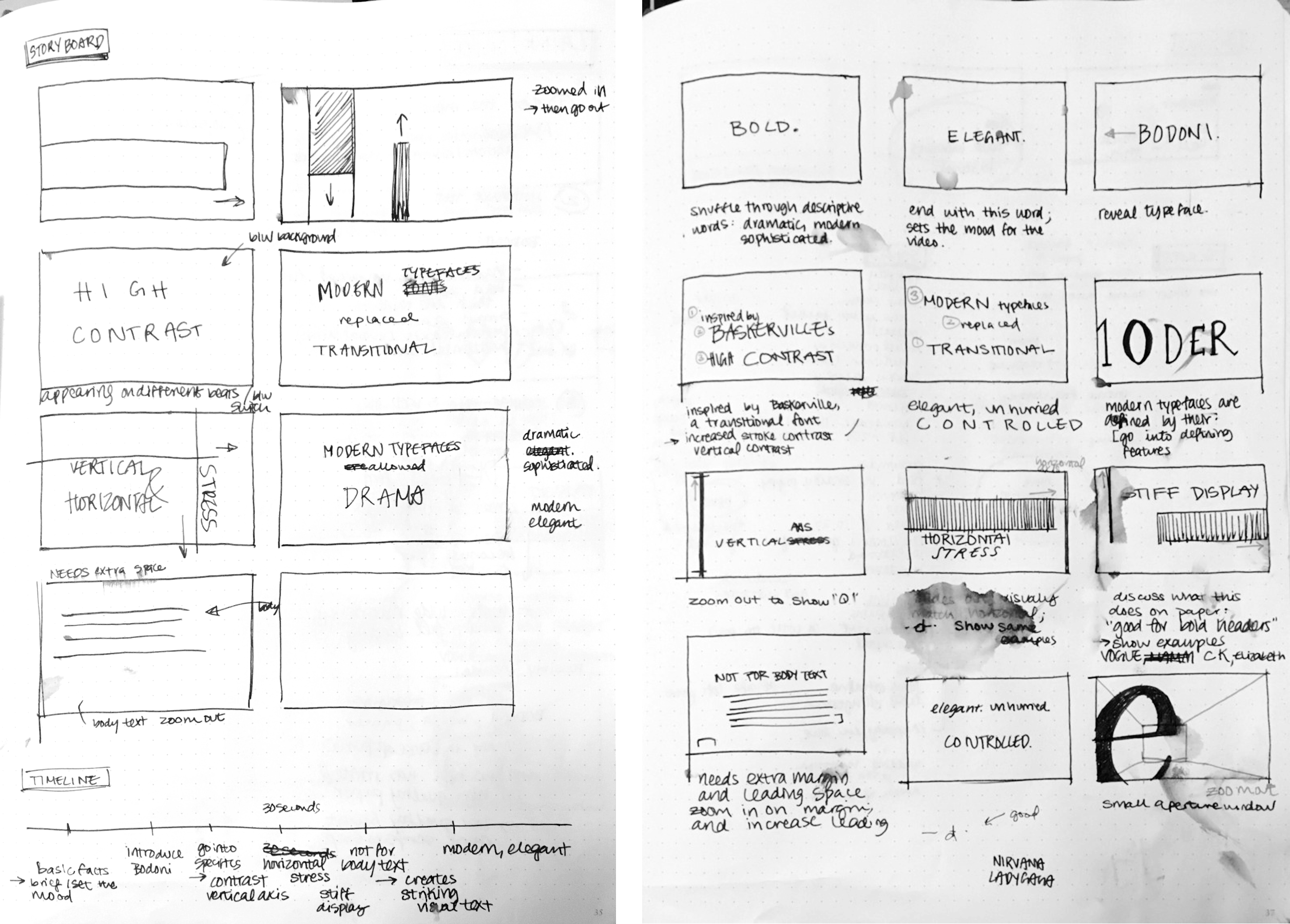
I then began my storyboard on Illustrator — I found it frustrating to work with type on paper; the imagery I created didn’t seem to fit what I had in my mind, given that I couldn’t easily handwrite type — and also chose a color palette. Working in Illustrator also helped me easily move around key frames when I found that certain scenes made sense rearranged.
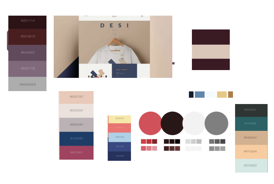
For color palettes, I played around with a lot of different schemes by searching up elegant moods, but ultimately decided on the one I have due to its elegant base but complimentary accent colors for the “high contrast” component of Bodoni.

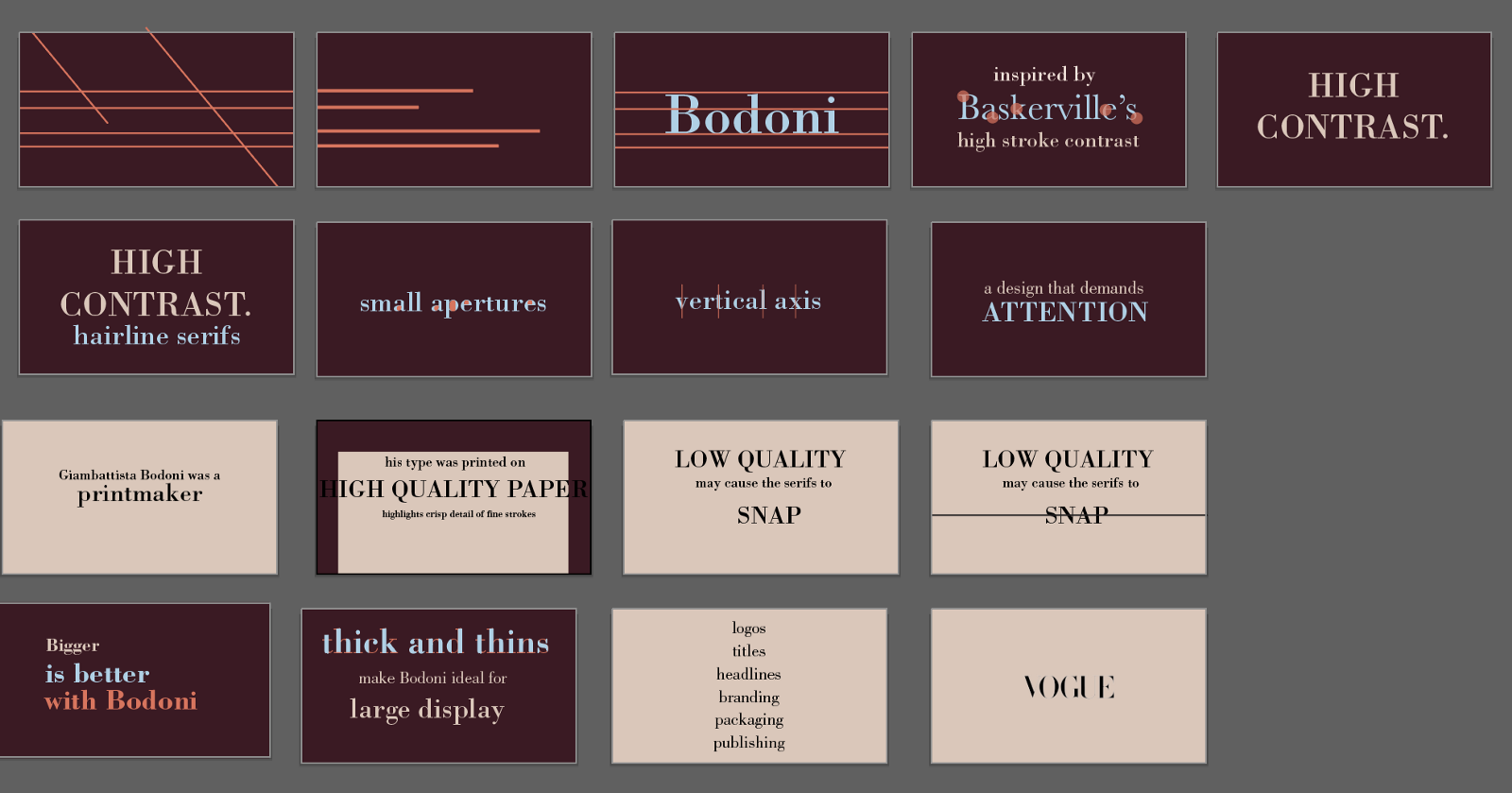
I also wanted to use animations to portray the “boldness” or Bodoni. In my typeface spread, I had thought of using lines and blocks of color to do this and I decided to carry this through in my video. In my initial story boarding, I randomly placed lines in the initial keyframe to get the mood going, and as I did so, I realized that the lines looked like the lines in typography used to outline descenders, x-height, ascenders, etc.
Similar to how I set the mood in the beginning of the video with animated moving blocks, I wanted to end my video with a same kind of mood, but only now, with the understanding of what the typeface Bodoni is. As such, I continued the “quick, fast info” type of scene I did in the beginning but with more context, talking about how Bodoni is used for headlines, titles, high end publishing, and so on as a finish.
As I began to create my video, a lot of my work centered around timing it to the music, which quickly became overwhelming to the actual video. A lot of my transition and animation didn’t match with what I was showing on screen for the sake of having a “sensible transition” (in the sense that the animations alone made sense, but were not in tune with the content being conveyed). After realizing this, I decided to go back and start simple. I stuck with describing the attributes of Bodoni and making sure my animations matched with it (i.e. having lines stretch when talking about vertical axis, highlighting apertures, etc), and then continued history of Bodoni in printing, how it should be used, and what it is currently best used for.
I think starting simple not only helped me with keeping my content clear and understandable, but also with the overall theme of “high contrast”. Both my music and my color scheme have more dynamics to it, being a little more bold, so I feel like my simple transitions were a nice complement to them and helped pull my video together.